Context
Nook is a web app for saving outdoor places that matter to you. Not to share them, not to perform them – just to keep them.
It was built around a single question: what would a digital tool look like if it genuinely tried not to steal your attention?
The concept
The brief was “réenchanter le monde” – re-enchanting the world. The easy interpretation would have been to make something beautiful or entertaining. That felt like a distraction from the actual problem.
The world doesn’t need more content. It needs less friction between people and the experiences they’re already having. Nook takes the opposite position to most apps: it wants you to put your phone down, not keep scrolling. It records a place, gives it personal meaning, and gets out of the way.
The name says it directly – a nook is a quiet corner, a space apart. That’s the whole brief.
Values
Presence
Nook invites you to be fully present, in the moment and in the place.
It’s not about collecting places, but about paying attention to the ones that matter. Nook encourages a more mindful relationship with the world, where digital technology complements the lived experience without detracting from it.
Simplicity
At Nook, simplicity is a conscious choice.
Everything that isn’t essential is stripped away to make room for what really matters: places, moments, meaning. A calm, clear interface, free from distractions – designed to let you breathe.
Discreet technology
Nook’s technology knows how to stay out of the way.
It’s there to support, never to draw attention to itself. Useful, quiet, unobtrusive – it stays in the background to let the real world take centre stage.
Visual identity
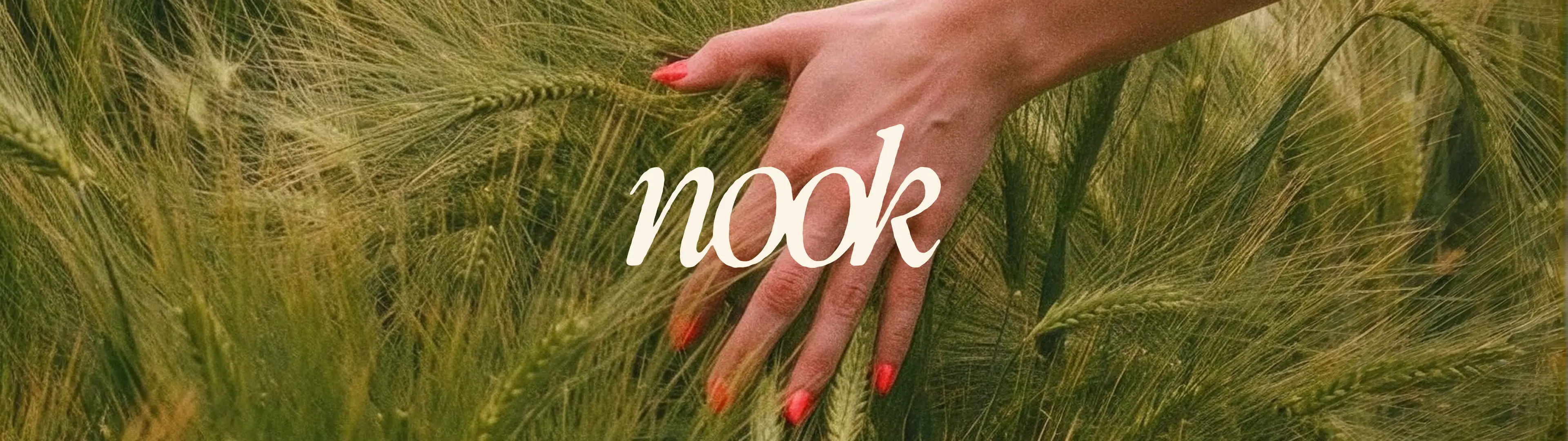
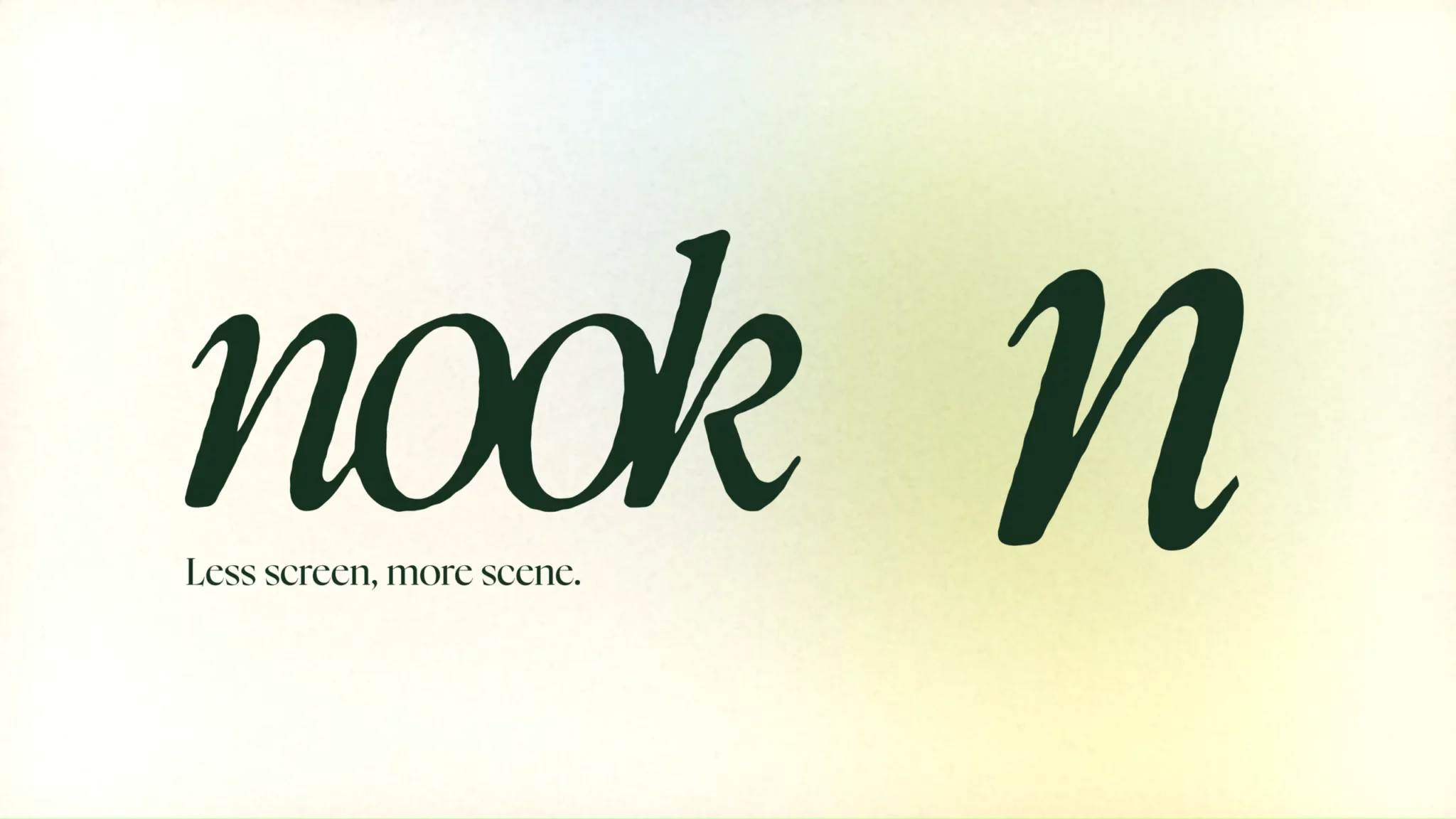
The logo is set in Nyght Serif italic – a typeface that brings editorial elegance without feeling cold. An ink-bleed treatment was applied to introduce organic imperfection: something that looks like it was printed, not rendered. For an app about the physical world, that felt right.
The logo exists in two forms: a full version with the tagline, and an icon version using just the n, for digital contexts where the full mark would be too small to breathe.
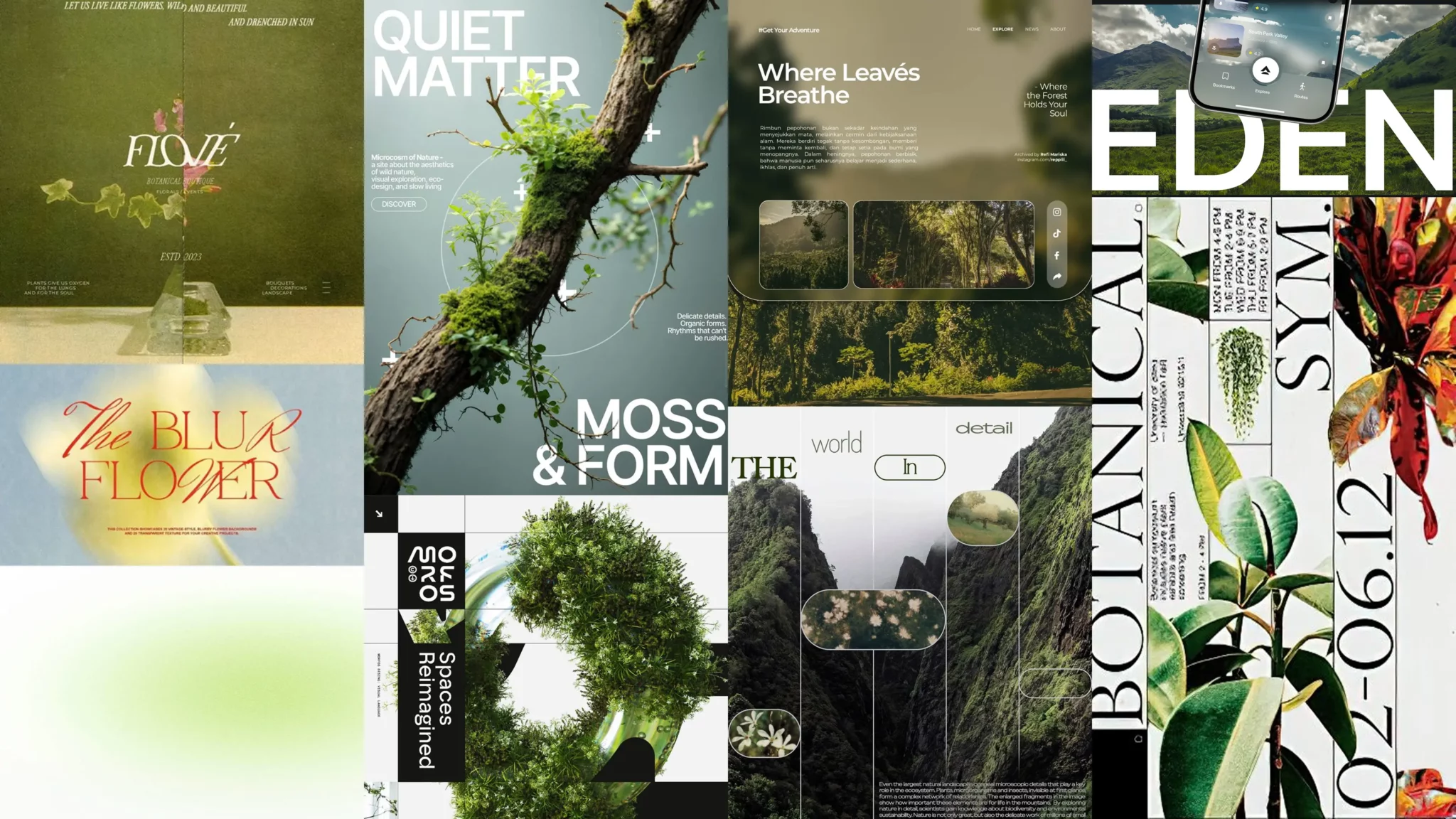
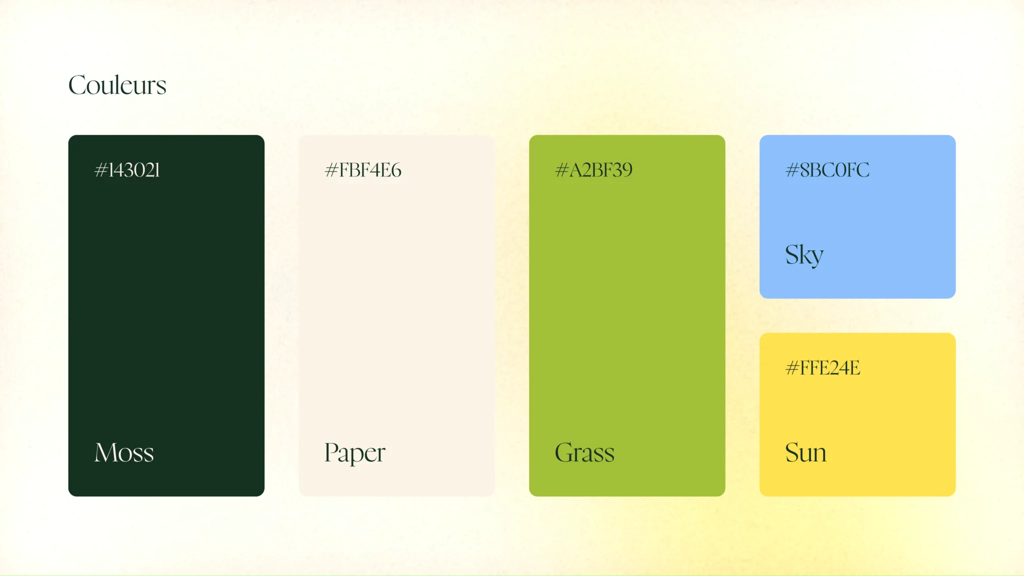
The colour palette moves between deep forest green, warm yellow-green, and off-white – nature tones, nothing synthetic. The gradient backgrounds are animated with grain, giving them a texture that feels more atmospheric than digital.
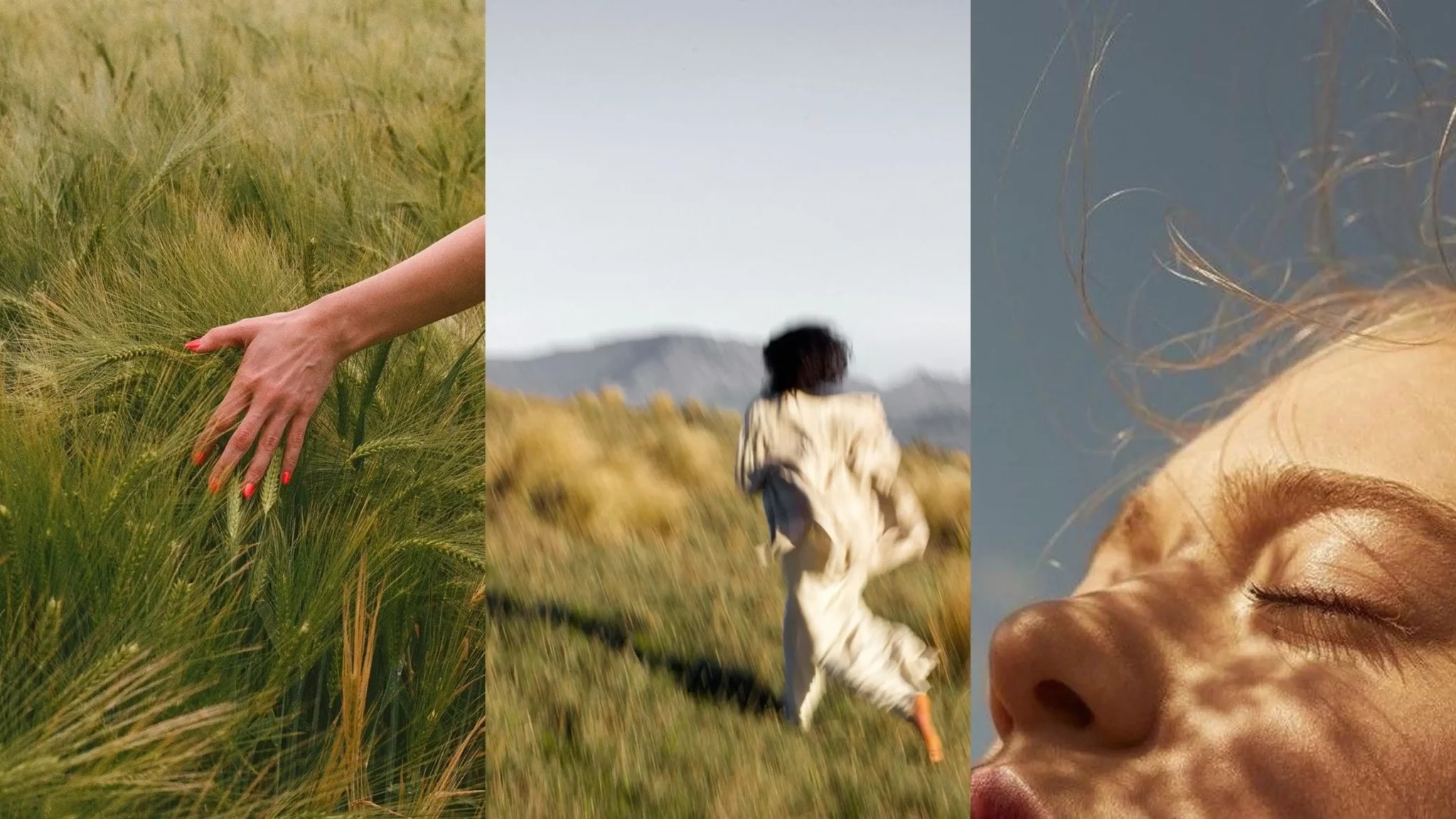
Photography follows the same logic: people in movement, outdoor environments, blur and grain. Nothing posed, nothing staged. The visual language is built to feel like a memory, not a product shot.
Tone of voice
Gentle
Nook speaks without being pushy.
The language is soothing; the sentences are open and inviting. We don’t give orders: we make suggestions.
Human
Nook speaks like a person, not like a platform.
The language is natural, simple and free from technical or marketing jargon. Every sentence could be spoken in a low voice.
Thoughtful
Nook’s voice takes its time.
It suggests rather than explains, and embraces silence. Not everything needs to be defined or justified.
Communication
The communication strategy was built as an extension of the project’s values, not a contradiction of them.
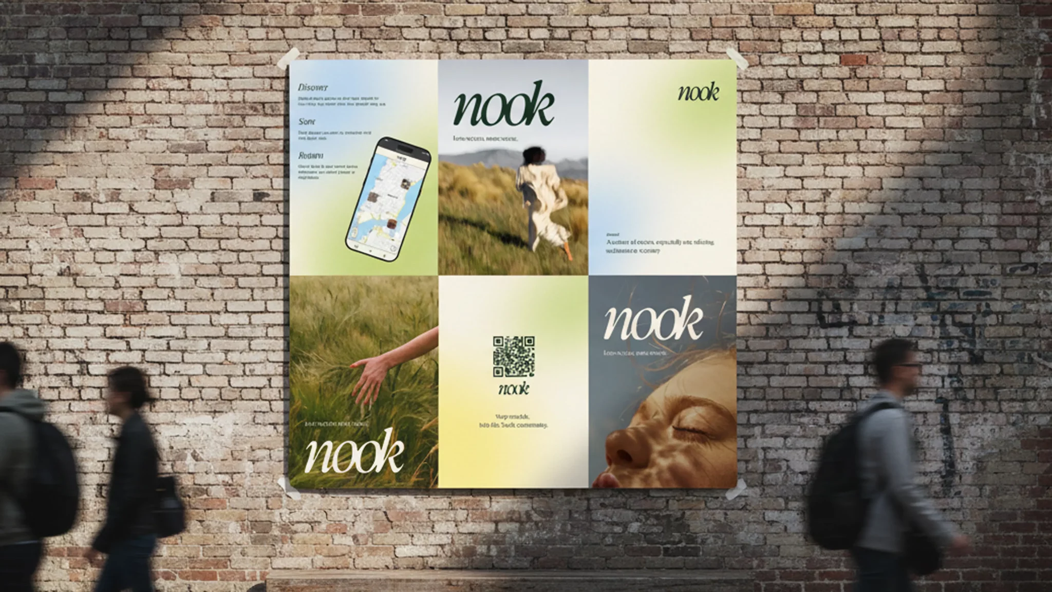
Posters were designed to be put on the streets – a direct encounter between the project and its potential users, in a physical, everyday context. No algorithm, no targeting, no feed.
A landing page was developed as the single digital entry point to Nook’s world, consistent with the visual identity and tone. You can visit it at nook.yermakov.fr
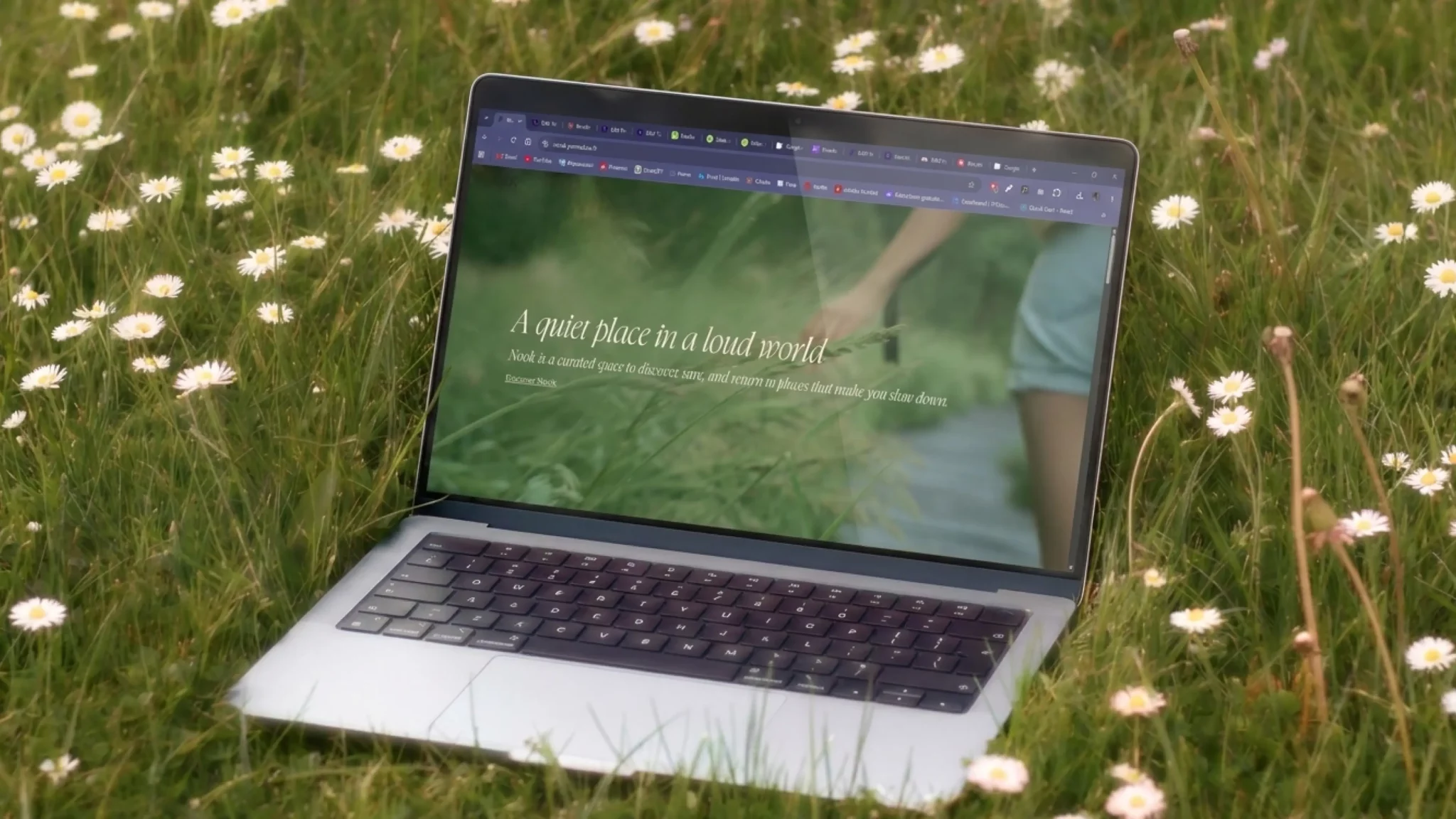
On social media: there isn’t any. That was a deliberate choice, not an oversight. Social platforms run on attention capture, performance metrics, and constant visibility – the opposite of everything Nook stands for. Promoting a calm, intentional app through the loudest, most attention-hungry channels available would have been incoherent. The risk was that fewer people would discover it. That felt like the right trade-off to make.
The app
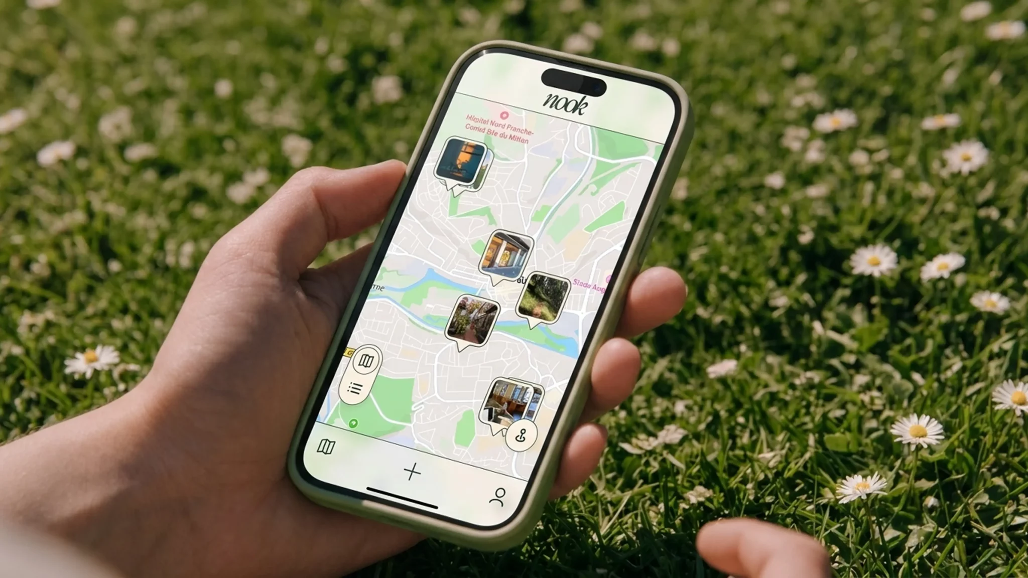
Nook is a fully functional web application – accessible across devices, built on WordPress with SCF for location data management, Mapbox for the map interface, and Antigravity for development assistance.
The interface does three things: browse a map, add a place, find places you’ve already saved. That’s it. Every feature that wasn’t essential was left out.
The live app is accessible at nook-app.yermakov.fr
What's next
A React rebuild with PocketBase to replace the WordPress architecture. A desktop version for more comfortable map browsing. Group activities, saved posts, lightweight social interactions, weekly challenges – features that extend the concept without contradicting it.
This is a first version. It works, it’s coherent, and it knows what it is.