Context
OFFF is one of Europe’s most respected graphic design and digital creativity festivals, held in Barcelona every spring with editions in cities including Madrid, Bogotá and Shanghai.
The brief: reimagine OFFF’s visual identity from the ground up, building something that could adapt to each edition of the festival while remaining immediately recognisable as OFFF.
The project covered four phases: research and concept development, visual identity, motion design, and app prototyping.
Research
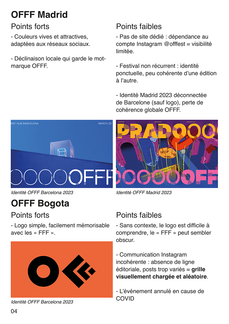
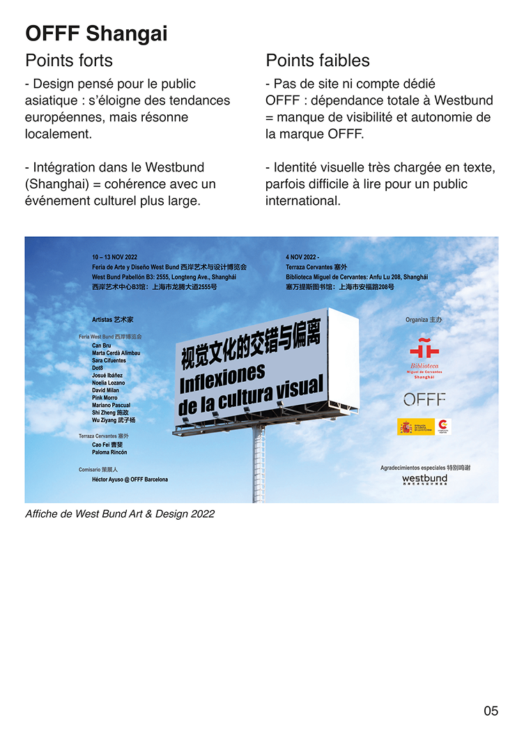
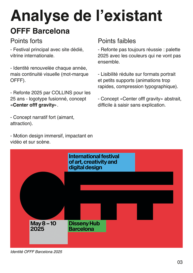
Looking at OFFF’s visual history, one problem kept surfacing: inconsistency. Each year’s identity felt disconnected from the last, and the different city editions had almost nothing tying them together visually. For a festival about digital creativity, the identities also felt surprisingly disconnected from anything digital.
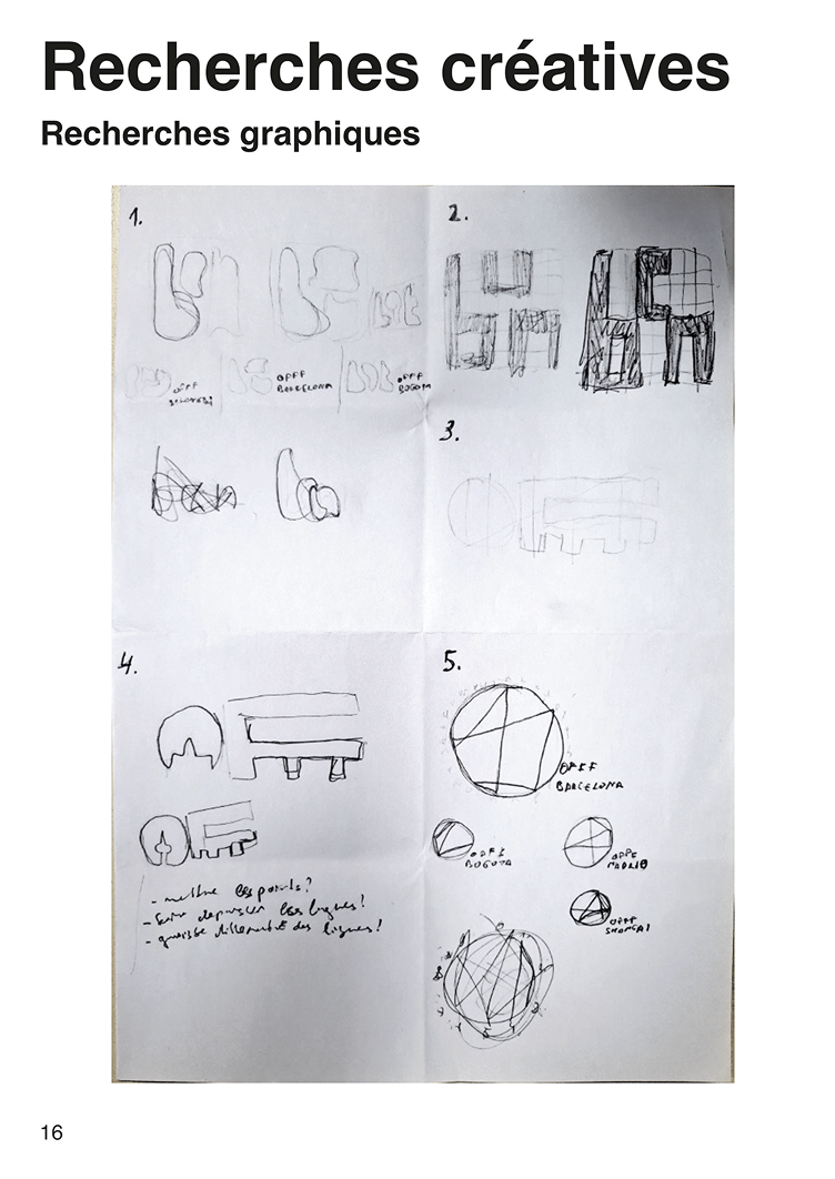
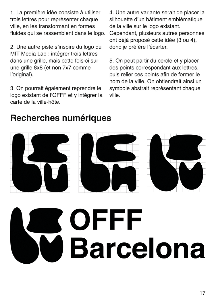
The idea of a generative, system-based identity had a clear reference point: MIT Media Lab’s identity, where a single algorithmic logic produces a unique mark for every member of the institution. The challenge was applying that same thinking to a festival context – where the variable isn’t a person, but a city.
That became the starting point. If OFFF is fundamentally about the intersection of design and technology, the identity should feel like it came from that world – not just reference it decoratively.
Visual identity
The concept is built on two foundational elements of digital design: binary code and pixels.
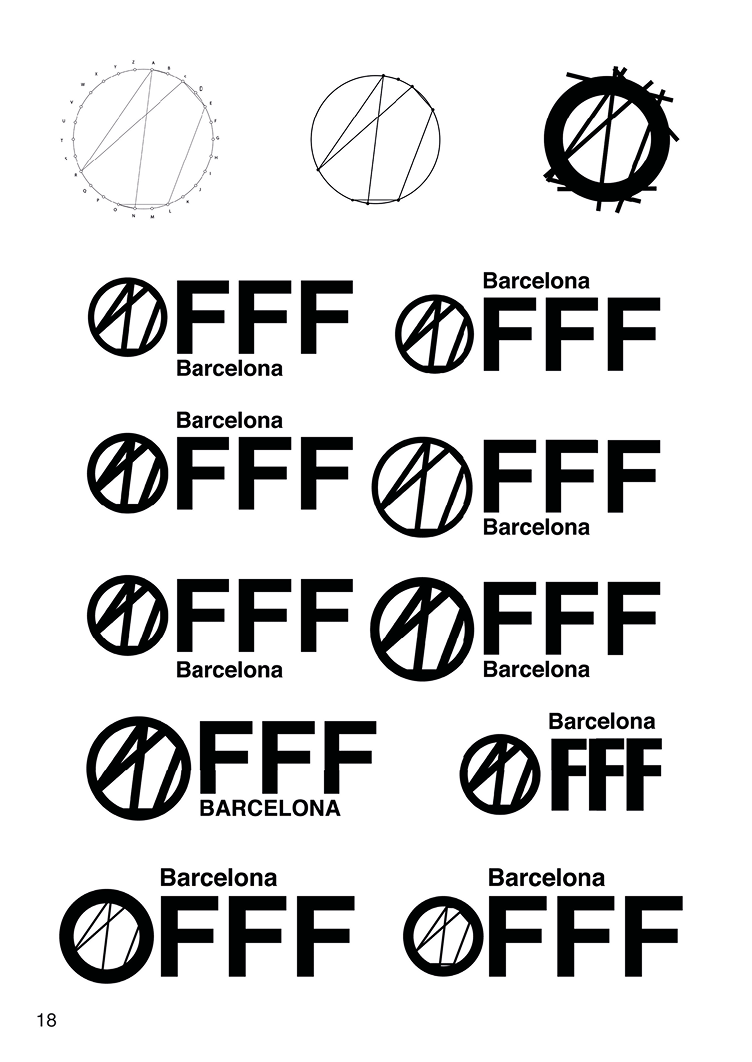
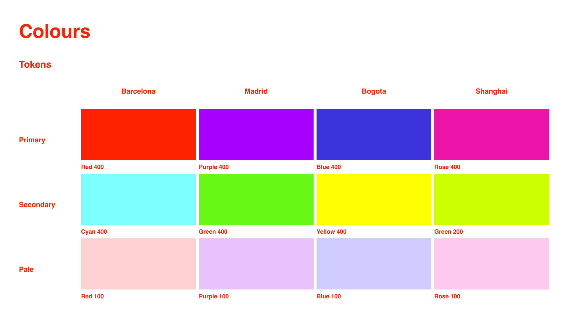
For each host city, three letters are selected to represent it. Those letters are converted into binary, then placed on a grid. Every 0 becomes an empty square, every 1 a filled one – generating a geometric symbol that is unique to each city but produced by the same system every time. Barcelona, Madrid, Bogotá, Shanghai: each gets its own logo, all unmistakably OFFF.
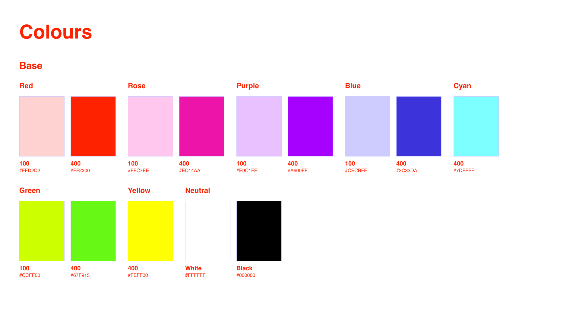
The color palette pulls from the tones of a broken or glitching screen – bright, slightly wrong, digital.
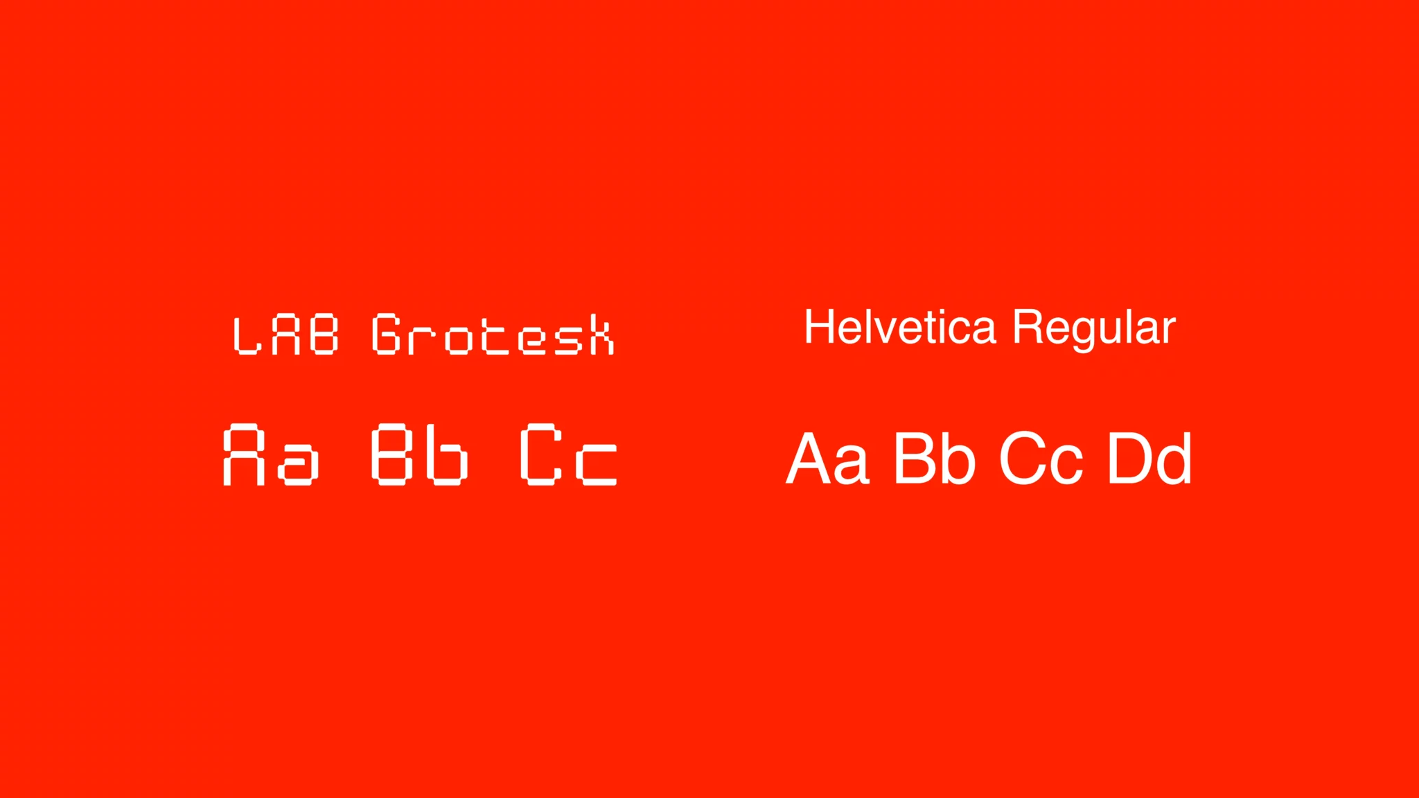
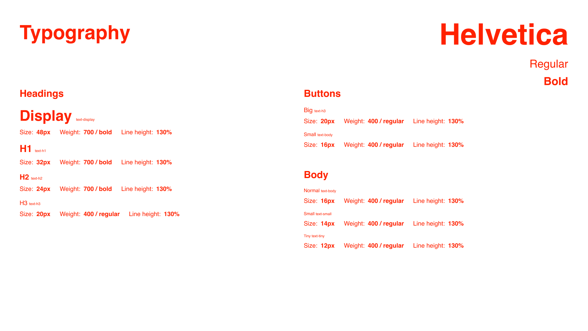
Lab Grotesk was chosen for the logotype: its geometric construction mirrors the pixel grid of the symbol without competing with it. Helvetica handles everything else, keeping the system from tipping into oversaturation.
One deliberate tension: the festival’s existing photography – candid, lively, very human – was kept intact. The contrast between those images and the cold geometric identity is part of what makes both feel stronger.
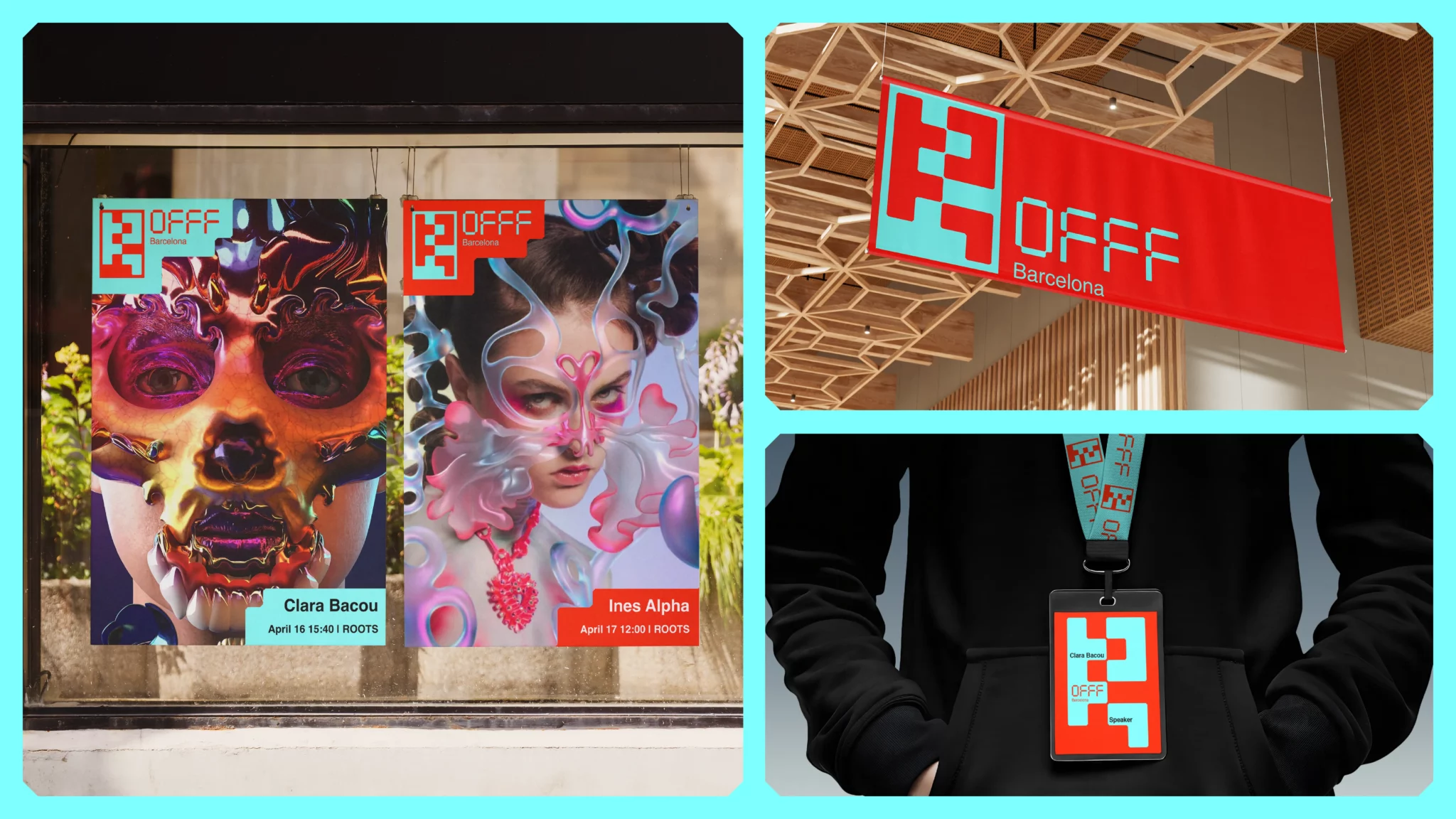
Deliverables included city-specific posters, artist posters, interior hanging banners, staff badges, and a social media template system.
Teaser
For the motion design component, I produced a festival teaser built entirely within the visual identity system – presenting the essential festival information and key participating artists. The soundtrack is the instrumental of Charli XCX’s Von Dutch: digital, slightly abrasive, energetic in exactly the right way.
App prototype
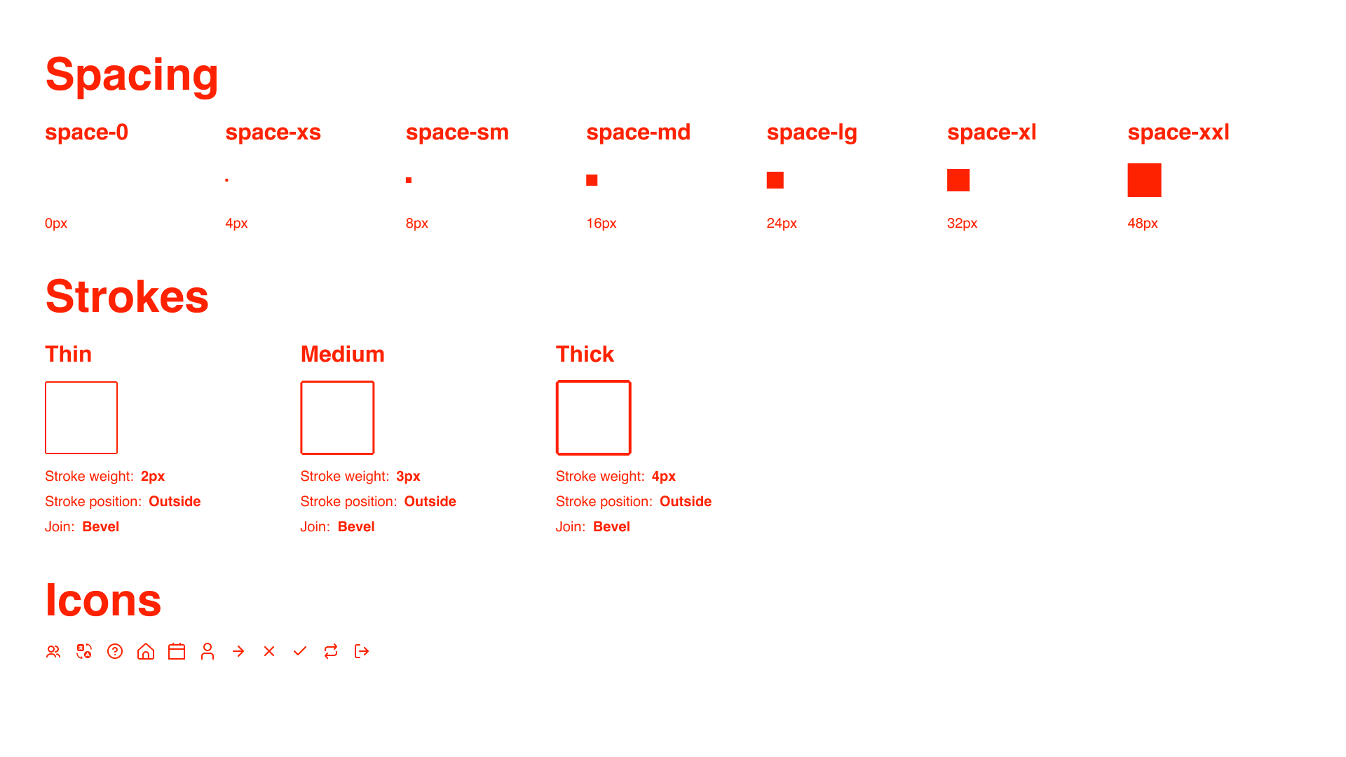
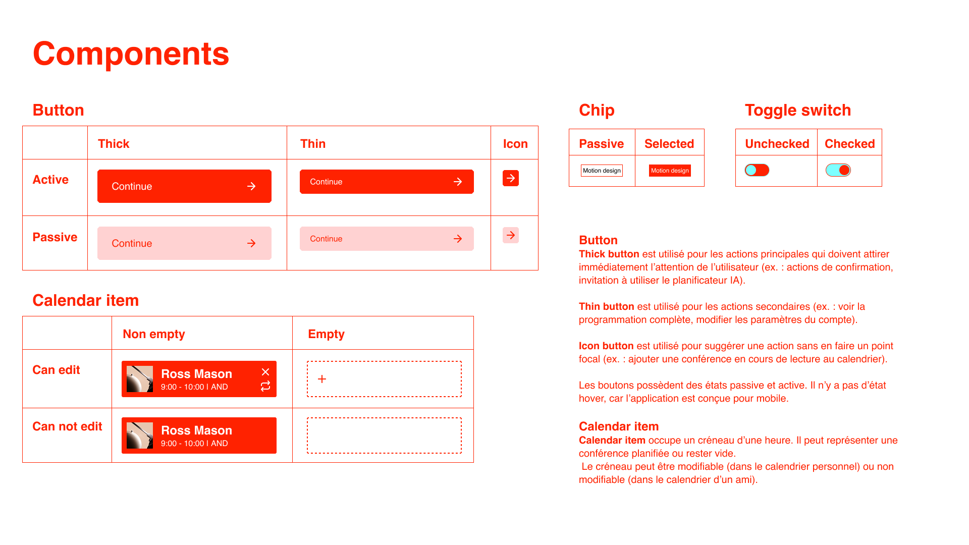
The final phase was a UX prototype for a festival companion app – designed to help attendees plan their day based on their interests and how they’re feeling that specific day, rather than a rigid schedule. The prototype includes a full reusable design system built in Figma.
Out of all student projects submitted by my university, this one was selected by the jury to be presented at OFFF NXT in Barcelona – to a live audience of international design professionals.
The reception was warmer than expected: people approached afterward to share their reaction, some posted it to their stories on the spot, and the event organiser told my teacher it landed well.
For something that started as a university assignment, it traveled further than anyone expected.