Context
ZETA-SE is an engineering startup based in Besançon, specialised in vibration mitigation – custom solutions for companies dealing with mechanical noise, resonance, and structural instability. Not the most obvious branding brief, but one of the most interesting ones I’ve worked on.
This was my first complete branding project handled from beginning to end, during my apprenticeship. The starting point was an existing logo the client wanted evolved, not replaced.
Research
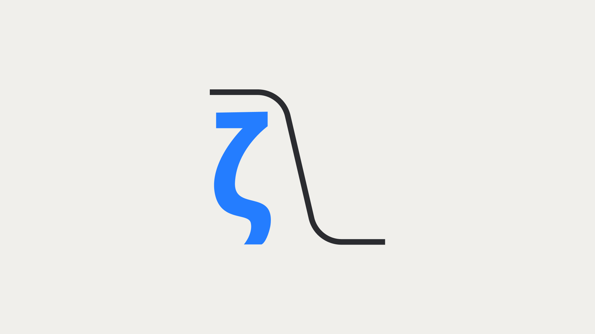
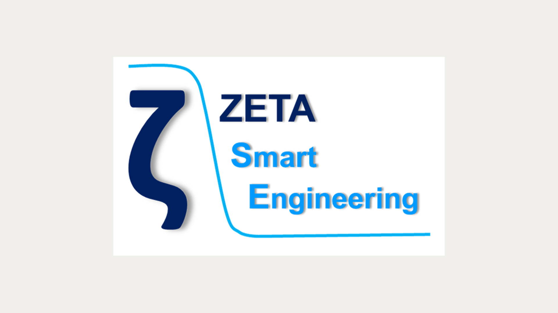
The existing logo had good bones – a Greek letter Zeta (the symbol for damping ratio in vibration physics) combined with a curve representing low-pass filter amplitude response. Technically precise, conceptually solid. The execution was the problem: heavy shadow effects, unbalanced versions with the wordmark, colour choices that made a young company feel older than it was.
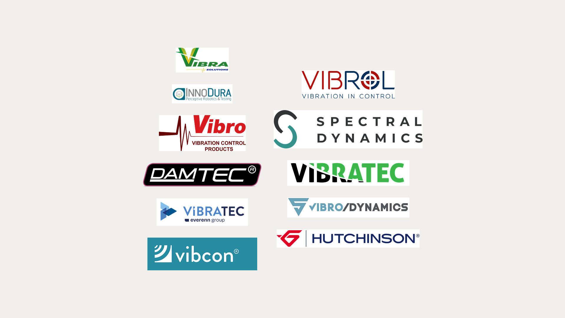
Looking at competitors confirmed the direction. Most engineering firms in this space use blue and red, reference movement and precision, and look like they haven’t been redesigned since 2008. The opportunity wasn’t to break industry codes – it was to respect them while looking like the decade the company actually operates in.
Exploration
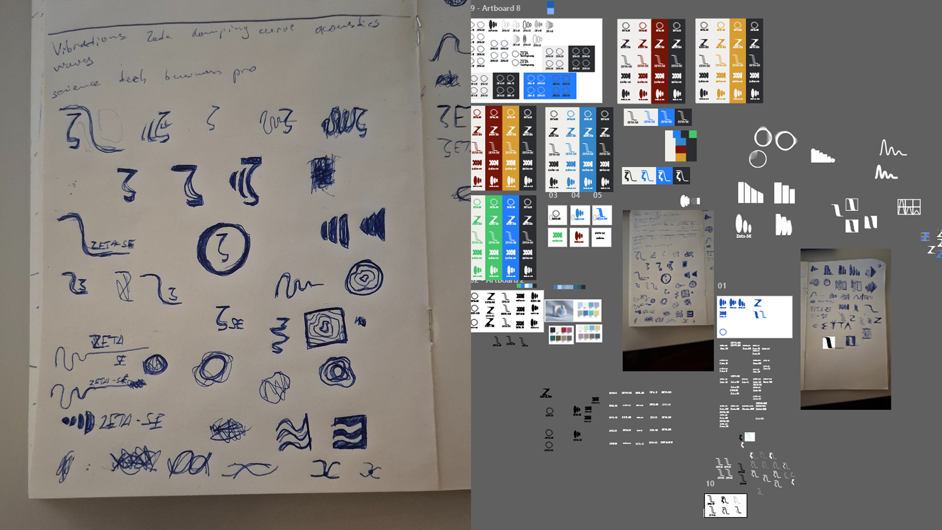
I sketched five distinct logo directions before moving into Illustrator: explorations around the letter Z, the Greek zeta form, vibration waveforms, and damping curves. Each proposed a different angle on what the company actually does.
After presenting the directions, the client decided to keep the existing logo rather than adopt a new one – a common reality of client work, and not an unreasonable decision given how embedded the mark already was in their materials.
Solution
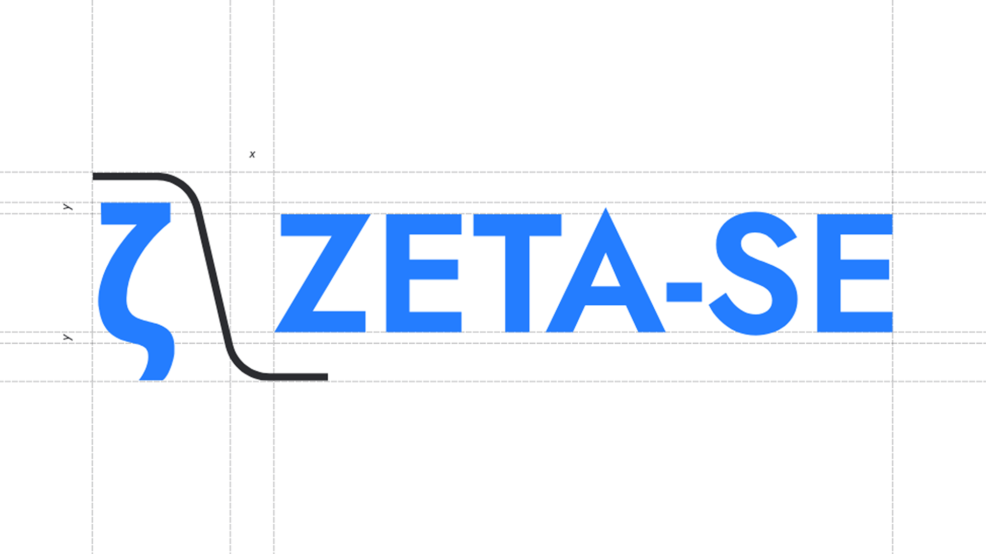
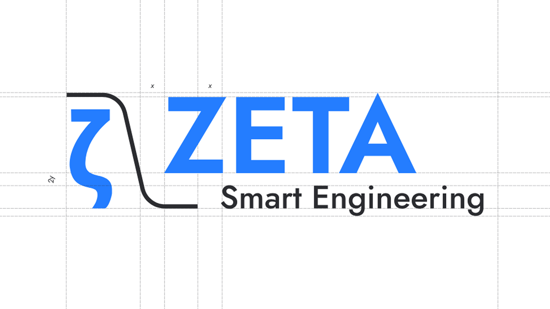
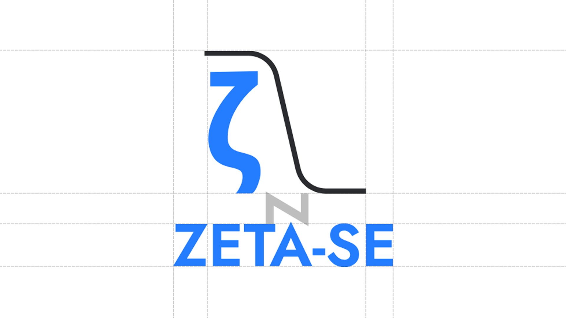
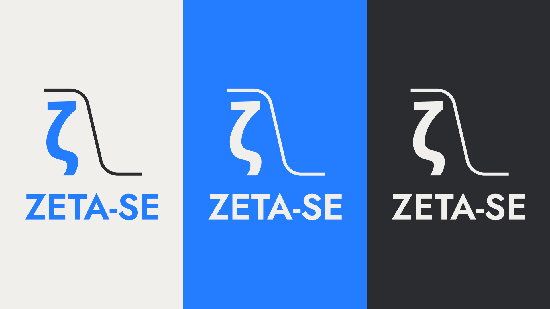
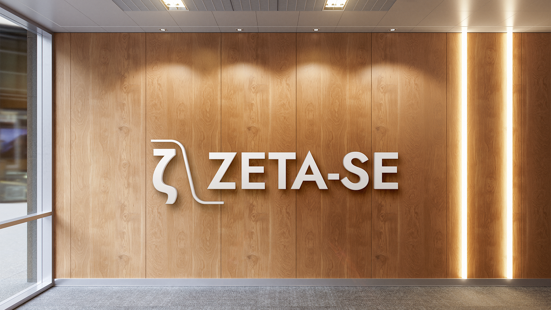
Faced with a logo I couldn’t fundamentally change, I shifted focus to what I could control: simplifying the forms, updating the colours to read more contemporary, and then building an identity system strong enough to carry the brand regardless of the logo’s limitations.
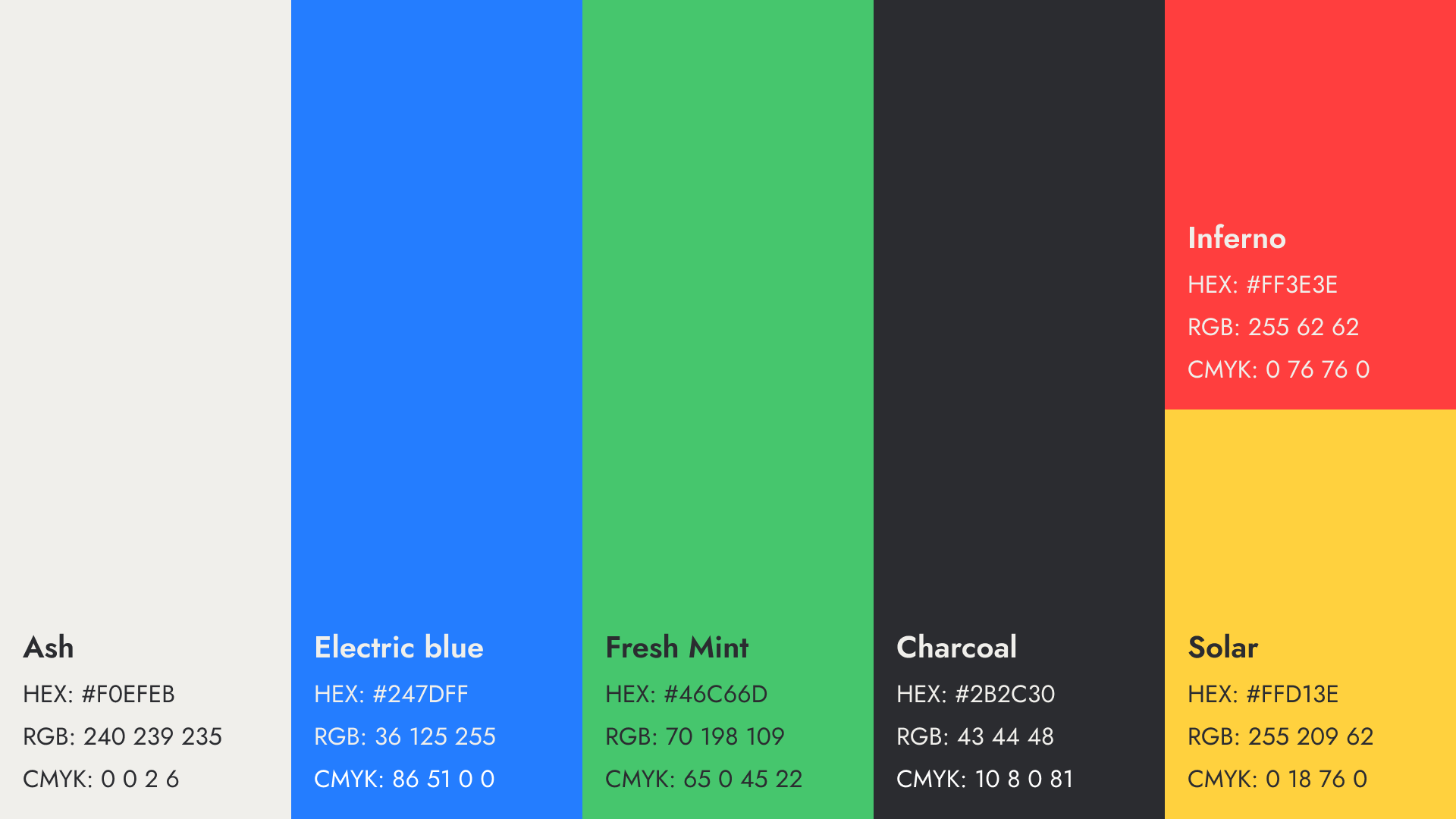
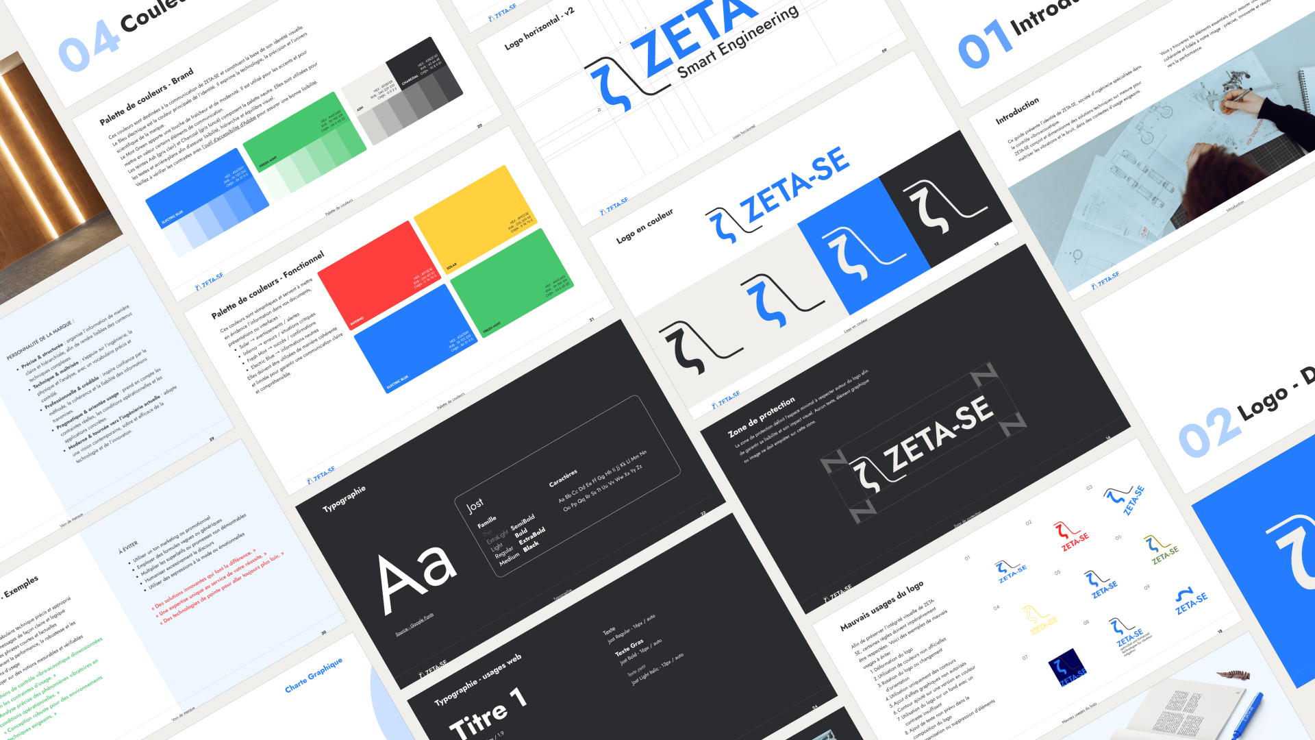
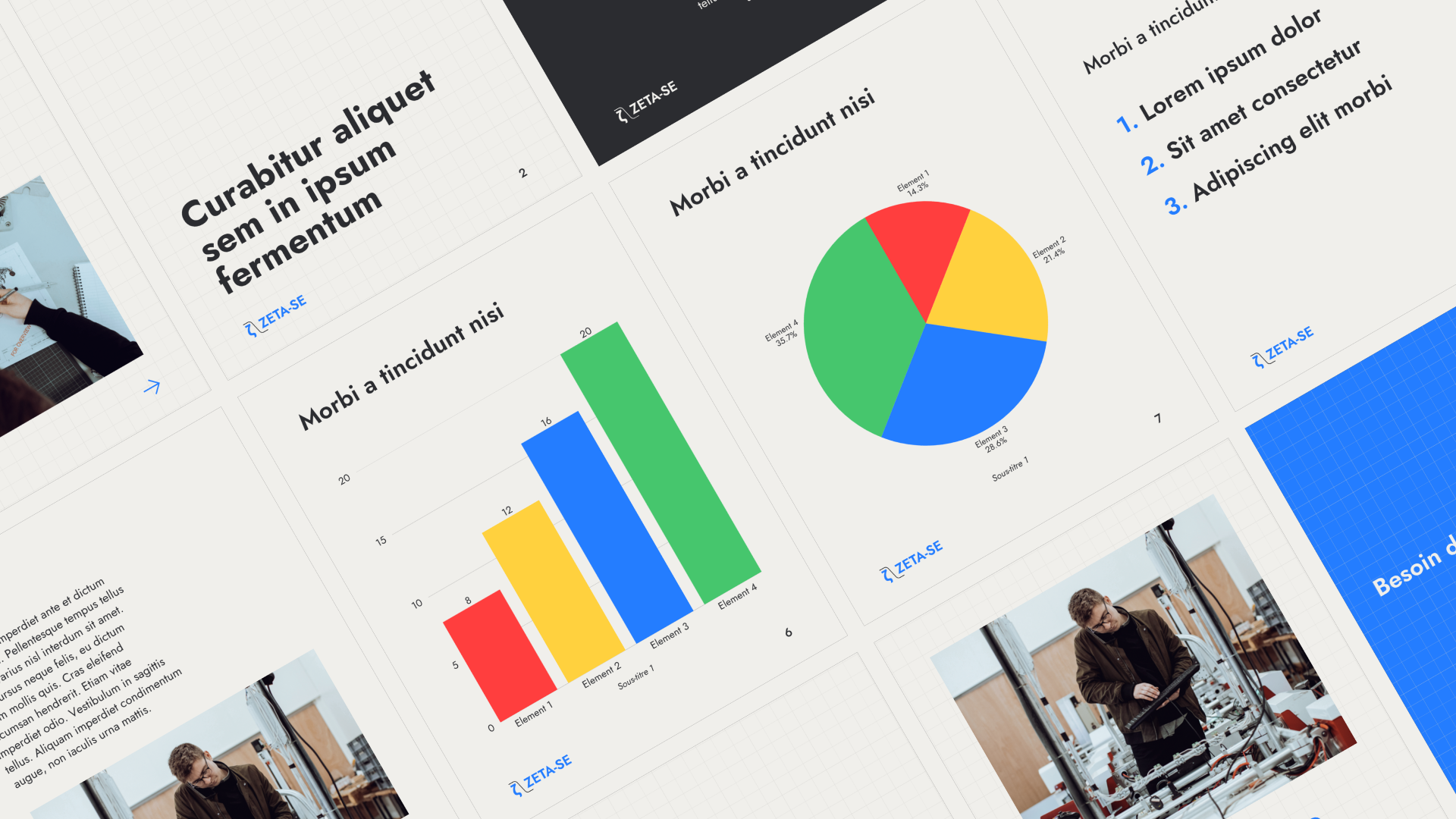
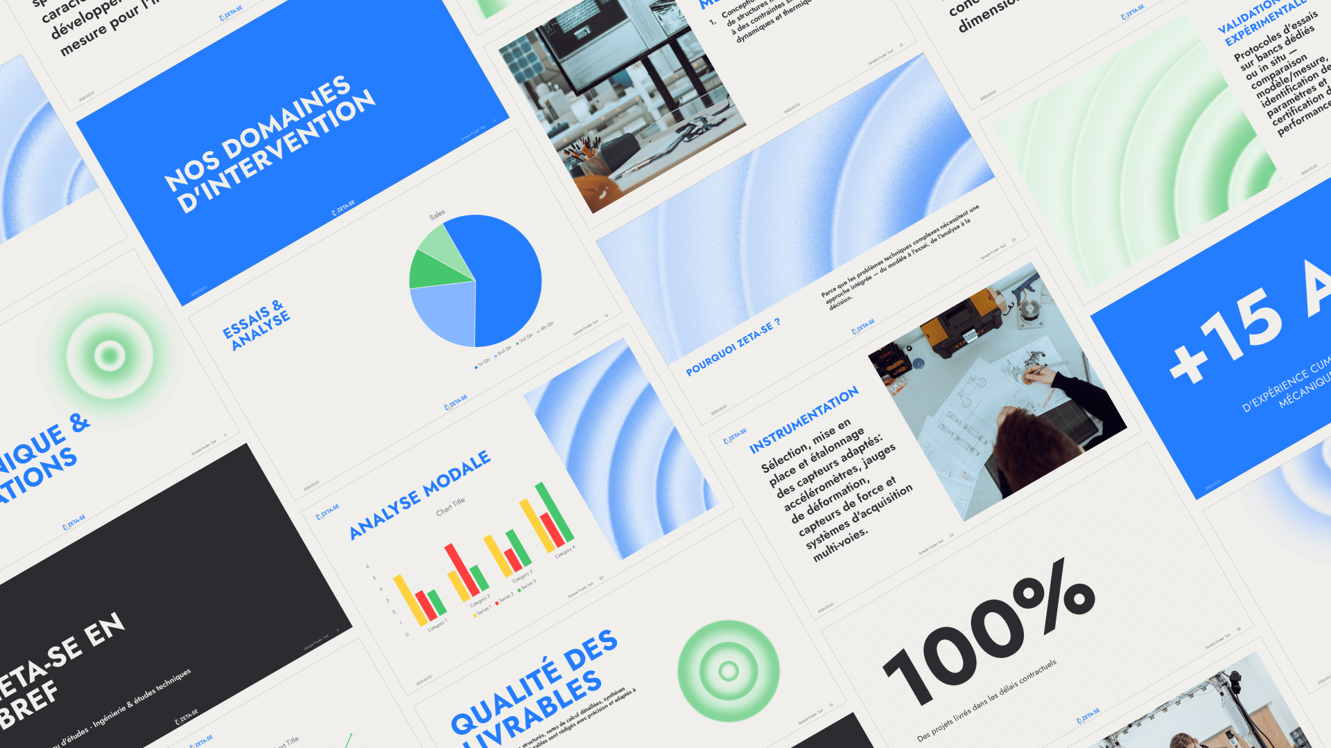
The colour palette was built in two layers – a brand palette for general communications and a set of semantic colours designed specifically for scientific presentations and data-heavy documents, where colour needs to do functional work, not just aesthetic work.
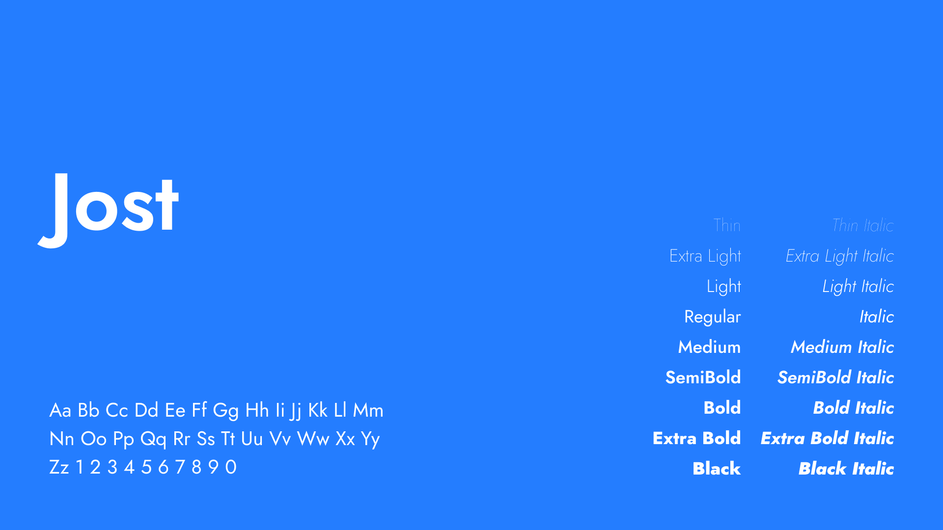
For typography, Jost does double duty: it works as the wordmark typeface and holds up across all communications without needing a secondary family.
The photography direction was defined around technical precision in real engineering environments – clean workspaces, measurement instruments, hands-on work with advanced equipment. The palette stays cold: steel greys, clinical whites, dark backgrounds with occasional warm accents from amber instrument displays. No decorative staging, no stock-photo ambiguity.
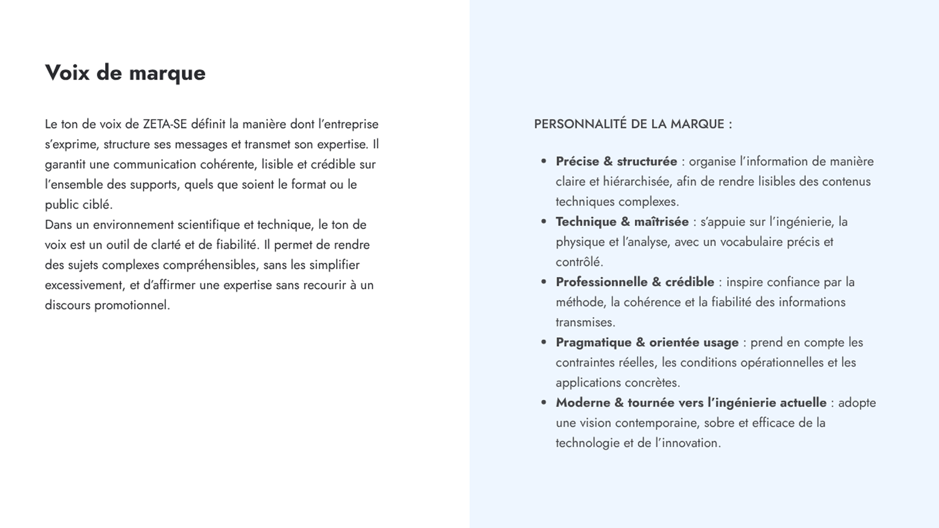
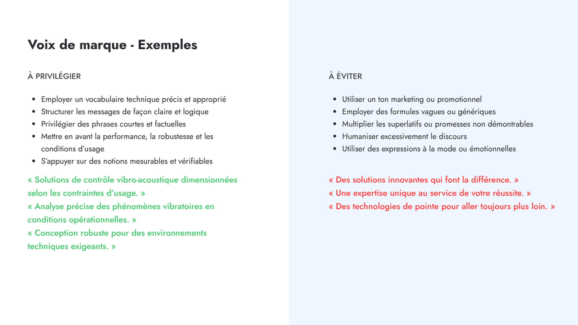
Tone of voice was written for engineers and technical decision-makers specifically. Precise, factual, structured – complex subjects made readable without being simplified. Measurable realities over claims. Short sentences, controlled vocabulary, no marketing inflation. The brand communicates like a well-written technical brief, which is exactly the register its audience responds to.
Deliverables
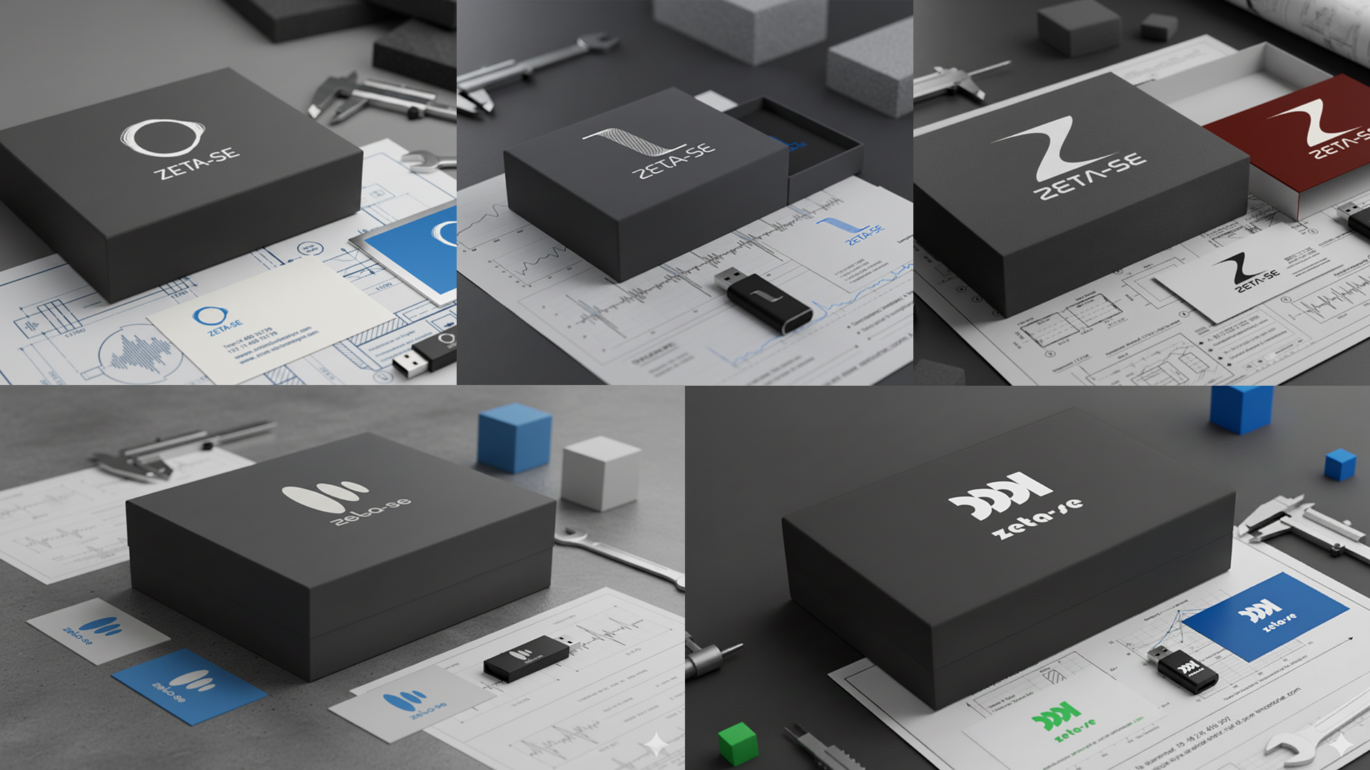
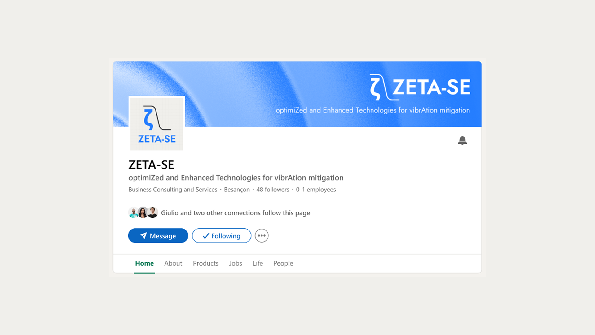
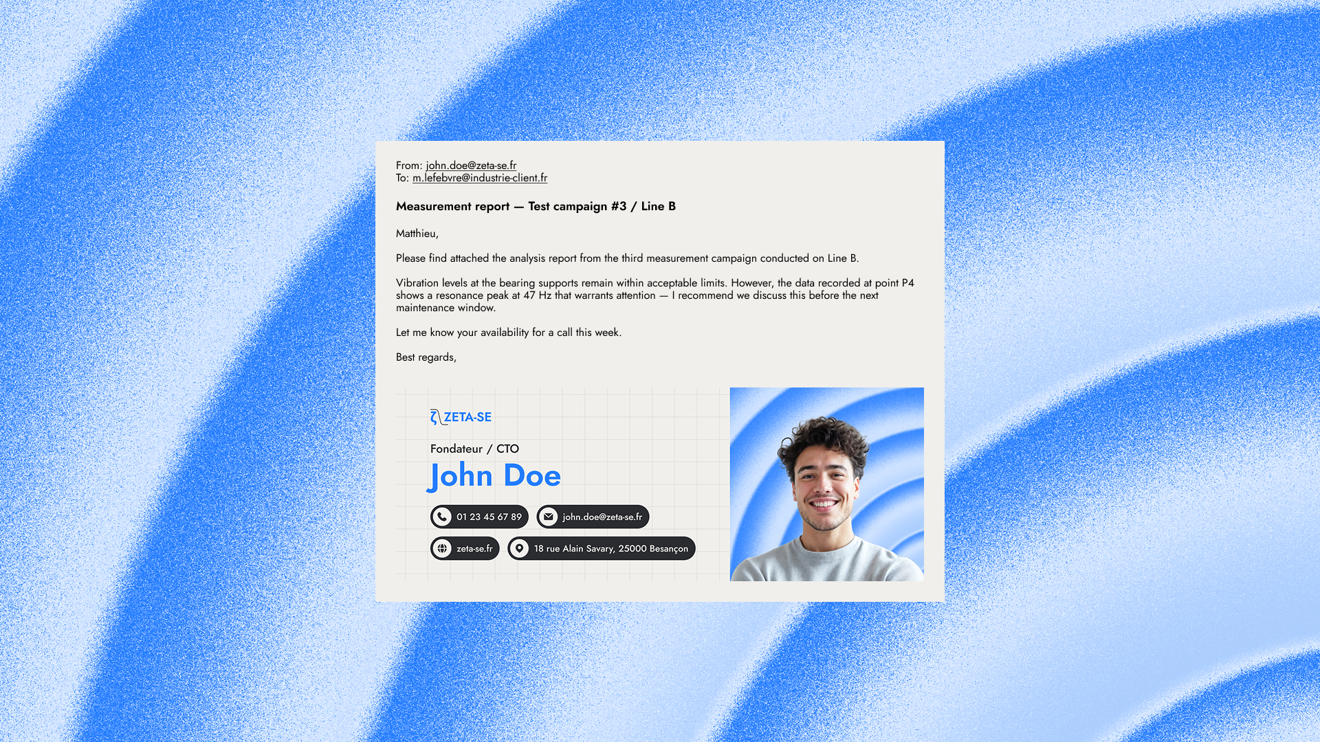
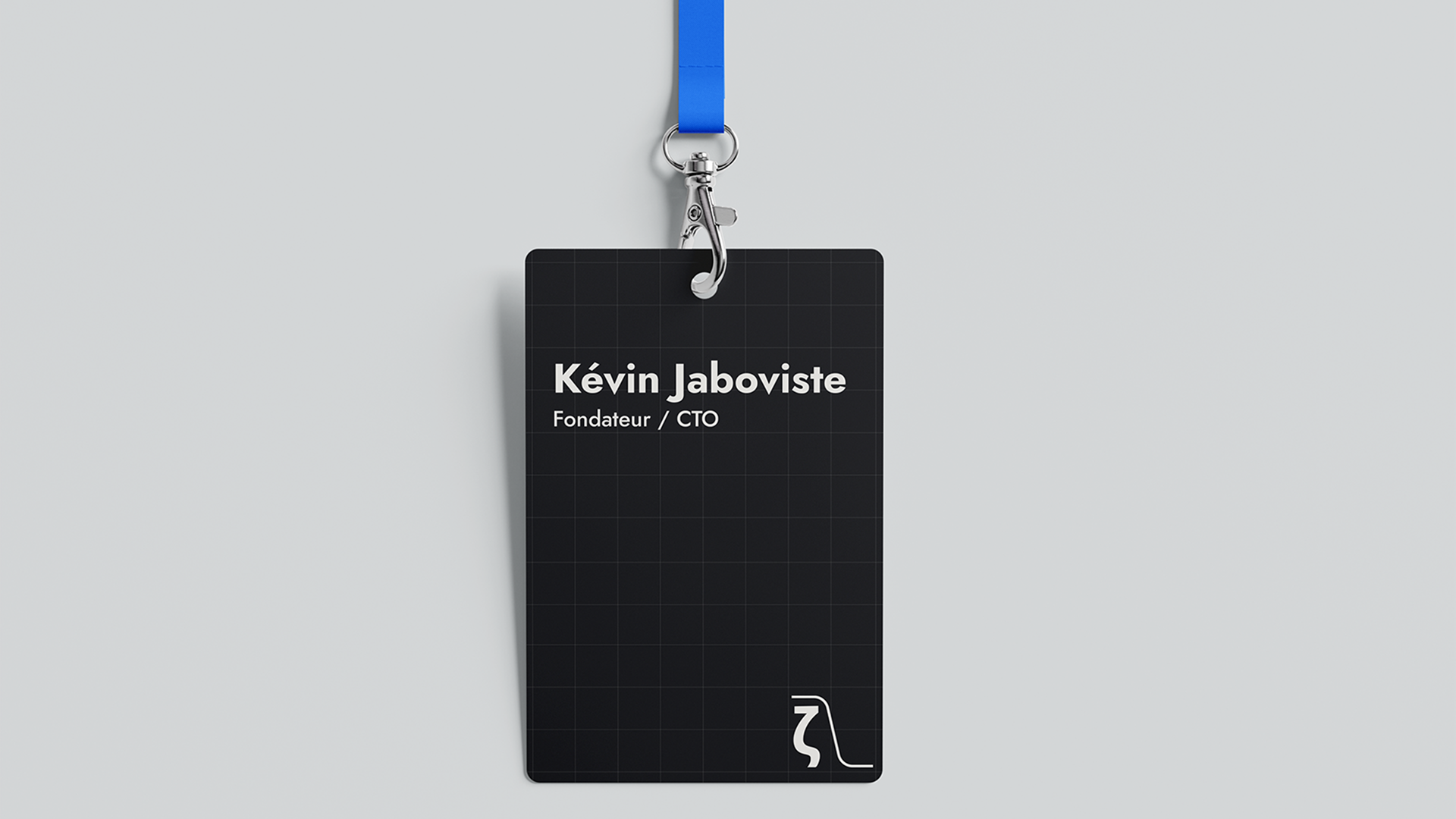
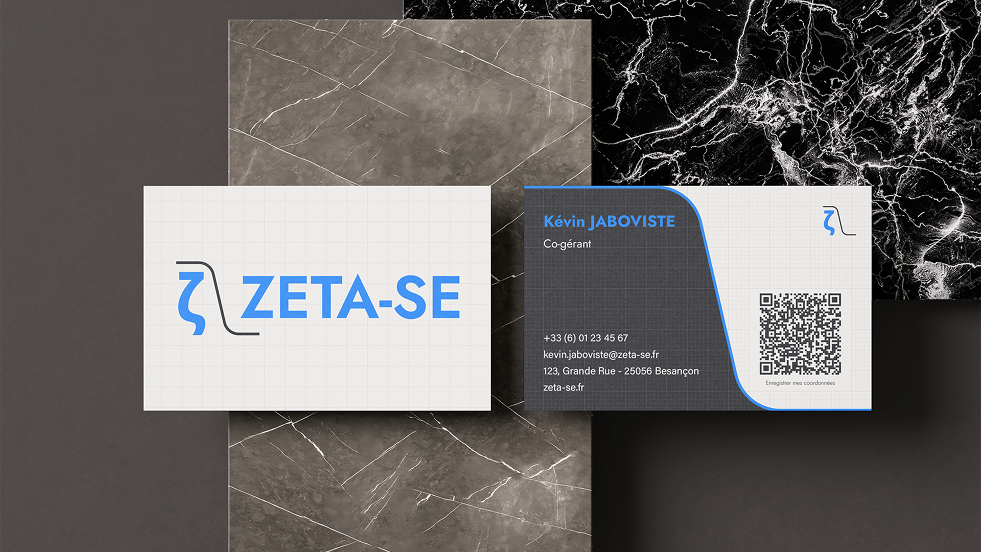
Logo suite, brandbook, social media templates, PowerPoint templates, email signatures, and business cards.